Data Visualization with Python Seaborn Line Plot
Seaborn is like a toolkit that helps us make pictures of our data. We use it to show what our models think might happen and to look at the differences in our data.
Seaborn Line Plots show how things change over time or across different categories using a line that connects points. These plots help us understand connections between numbers that change smoothly or in steps.
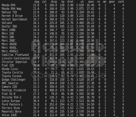
DataSet:
Creating Your First Seaborn Line Graph:
To begin making Line Plots, we have to put a software tool called Seaborn into our Python toolbox. You can bring in Seaborn by using this command:
pip install seabornOnce you finish installing it, bring the library into your workspace and start using its tools and features.
import seabornThroughout our work with Seaborn, we’ll use the Matplotlib library to make our data into clear and easy-to-understand visuals.
Example 1: Making a Seaborn Line Plot with Random Data
import pandas as pd
import seaborn as sns
import matplotlib.pyplot as plt
Year = [2002, 2004, 2006, 2008, 2010, 2012, 2014]
Profit = [20, 23.5, 27, 32, 38.4, 46.1, 59.1]
data_plot = pd.DataFrame({"Year":Year, "Profit(Crores)":Profit})
sns.lineplot(x = "Year", y = "Profit(Crores)", data=data_plot)
plt.show()Output
Example 2: Making a Line Plot using Data to show how the columns of data are connected
import pandas as pd
import seaborn as sbn
import matplotlib.pyplot as plt
info = pd.read_csv("/home/tirth/Downloads/mtcars_dataset.csv")
data = info.iloc[1:20,:5]
sbn.lineplot(x = "drat", y = "mpg",data=data)
sbn.set(style='dark',)
plt.show()
Inputted data sets:
Output
Multiple Seaborn Line Plots
We can make lots of lines in one plot to see different data together. We use the same or different data parts to show how they connect.
1. Making Colors for Different Data Points Using the “hue” Setting
The “hue” setting helps group the dataset’s different parts. It shows how the data on the x and y axes relate to the column you pick for the “hue.”
Syntax: seaborn.lineplot(a,b,info,hue)
Example
import pandas as pd
import seaborn as sbn
import matplotlib.pyplot as plt
info = pd.read_csv("/home/tirth/Downloads/mtcars_dataset.csv")
data = info.iloc[1:20,:5]
sbn.lineplot(x = "drat", y = "mpg", data=data, hue="cyl")
plt.show()
Output
2. Changing Line Looks with the “style” Setting
We can use “style” to make lines look different on the plot. We can show dashes, dots, or other styles with the x and y axes.
Syntax: seaborn.lineplot(a, b, info, style)
Example
import pandas as pd
import seaborn as sbn
import matplotlib.pyplot as plt
info = pd.read_csv("/home/tirth/Downloads/mtcars_dataset.csv")
data = info.iloc[1:20,:5]
sbn.lineplot(x = "drat", y = "mpg", data=data, hue="cyl", style="cyl")
plt.show()Output

3. Making Lines Different Sizes in Seaborn
In Seaborn’s lineplot() function, we can use the “size” part to show how multiple data bits relate. The lines change sizes based on how big the data is, showing different groups. Syntax: seaborn.lineplot(a, b, info, size)
Example
import pandas as pd
import seaborn as sbn
import matplotlib.pyplot as plt
info = pd.read_csv("/home/tirth/Downloads/mtcars_dataset.csv")
data = info.iloc[1:20,]
sbn.lineplot(x = "drat", y = "mpg", data=data, hue="gear",style="gear",size="gear")
plt.show()
Output
4. Changing How the Plot Looks with seaborn.set()
The seaborn.set() function in Python helps make the plot look different by changing the background style.
Syntax: seaborn.set(style)
Example
import pandas as pd
import seaborn as sbn
import matplotlib.pyplot as plt
info = pd.read_csv("/home/tirth/Downloads/mtcars_dataset.csv")
data = info.iloc[1:20,]
sbn.lineplot(x = "cyl", y = "mpg",data=data,hue="gear")
sbn.set(style='dark',)
plt.show()
Output

Conclusion
So, in this article, we’ve learned about Line Plots and the different ways they can be used.


